 Hajime Isayama’s Attack on Titan (Shingeki no Kyojin) is a curious beast, and not just because it’s a manga series populated with curious beasts. It originally started serialization in Kodansha’s Bessatsu Shōnen Magazine in 2009, and it’s a series that truly leans on the strength of its bizarre premise and narrative, because while Isayama can weave a pretty compelling yarn, the art itself can be downright ugly.
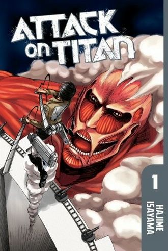
Eren Jaeger and his peers are among a group of humans unfortunate enough to populate a walled city on the edge of an even larger man-made fortification. There’s a good reason for the looming 50-meter walls in this world: Titans. These massive humanoids vary in size, with the largest of them tall enough to stand above the wall and, in the worst possible scenario, break through and devour the humans hiding within. It’s a reality the folks here have faced for the past century, resulting in a population that only knows what’s written in forbidden books when it comes to the land beyond the barricade.
The Titans are mostly mysterious, with little light shed on them throughout the first volume. After a tragic wall breach early on, we flash forward to Eren and the others as they’ve grown a bit and kicked off their duty of protecting what’s left of the human race. It’s a seemingly hopeless scenario from page one, but unlike some of his more cowardly comrades who have more or less resigned themselves to a bleak future, Eren is determined to take down these Titans and pull everyone from under their oppressive shadow.
Isayama’s art is mostly amateurish—the protagonists tend to have shape-shifting heads and skewed proportions, action is sometimes displayed at unclear angles, and most of the detail and time seems to have gone into the backgrounds. It ain’t pretty. The Titans kind of get a pass because their designs are so otherworldly, while remaining humanoid, with the most colossal of them looking like a giant inside-out boy. With them Isayama finds a nice balance between unintentionally ugly and surreal, adding to the disturbing atmosphere that creeps in whenever they invade.
Thankfully, as previously mentioned, Attack on Titan still manages to be hard to put down. Even with the uneven art, there are a few standout visual moments, and Isayama does a good job of creating intrigue with the promise of more details on the walled cities, the unique weapons used to pull off “three-dimensional maneuvers,” and more. Best of all, no punches are pulled when it comes to the brutal threat these monsters pose. It’s no wonder Attack on Titan became somewhat of a sleeper hit in Japan, winning a Kodansha Manga Award in 2011; it’s just a straight up solid page-turner. Hopefully Isayama’s art will improve as the story unfolds, because this is certainly one worth keeping up with so far, and now I’m even more curious about the upcoming film adaptation.
Publisher: Kodansha Comics
Story & Art: Hajime Isayama
© 2012 Hajime Isayama
Related Posts


